Make your Gleap widget feel like part of your product by customizing its appearance, structure, and behavior. From visual design to ticket visibility, you have full control over how the widget looks and functions.
Here are all options you can setup in the customization page:
Introduce Team
Enable this to show your team members inside the widget. You’ll need at least 3 members added to activate this option.
Welcome Message
Set a personalized greeting shown to users when they open the widget (e.g., “How can we help you today?”). You can also select the language for this message.
Greeting Options
Hide 👋 after greeting – Automatically hides the greeting emoji after the message.
Hide name – Hides the user’s name from the greeting.
Show latest conversation – Automatically displays the last message thread when the widget is opened.
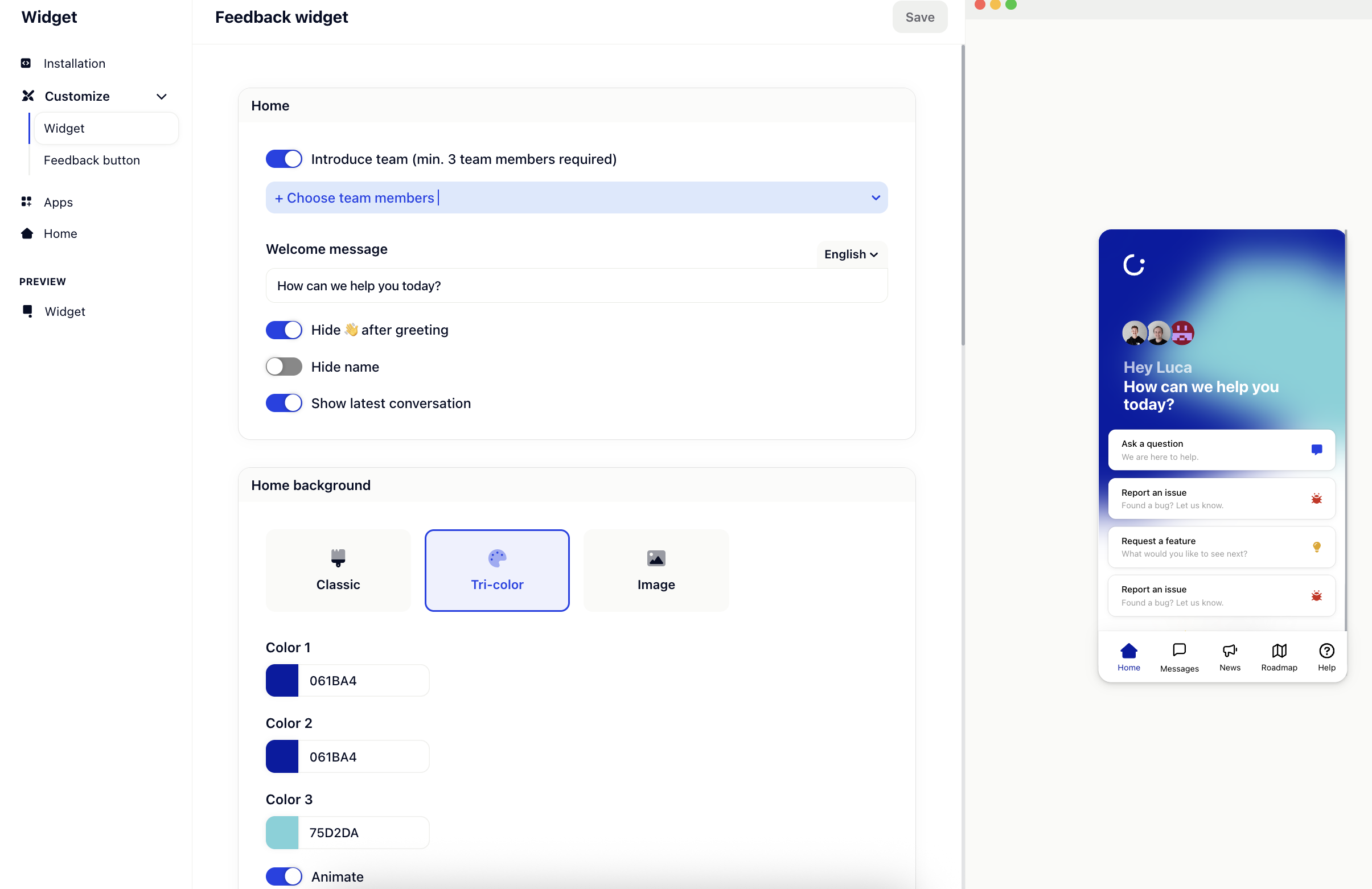
Choose a background style for your widget's home screen:
Classic – Standard Gleap look
Tri-color – Use three custom colors to create a gradient or multi-tone background
Image – Upload your own background image
You can customize:
Color 1, 2, and 3 (for tri-color backgrounds)
Enable animation for a dynamic visual effect
UI Color
Set the primary color for buttons and highlights.
Background Color
Define the widget’s overall background color.
Header Logo
Upload a custom logo (JPG, PNG, or SVG) that appears at the top of the widget.
Remove the Gleap branding
Enable this option (available on eligible plans) to remove the default Gleap logo and brand marks.
Customize what users see in the ticket list:
Show ticket number – Display the ticket ID
Show ticket title – Show the title of each ticket
Show ticket status – Display the current status (open, closed, etc.)
You can define which screen should be initially shown when you open the widget.
The options are:
Home
Conversations
Latest conversation
Roadmap
News
Help center
Send messages on “Enter”
Enable or disable sending messages with the Enter key. Great for accessibility or long-form replies.
Corner Radius
Adjust the shape of the widget — from sharp corners to fully rounded. Drag the slider to find your preferred style.
For full design control, you can inject custom CSS into the live feedback widget.