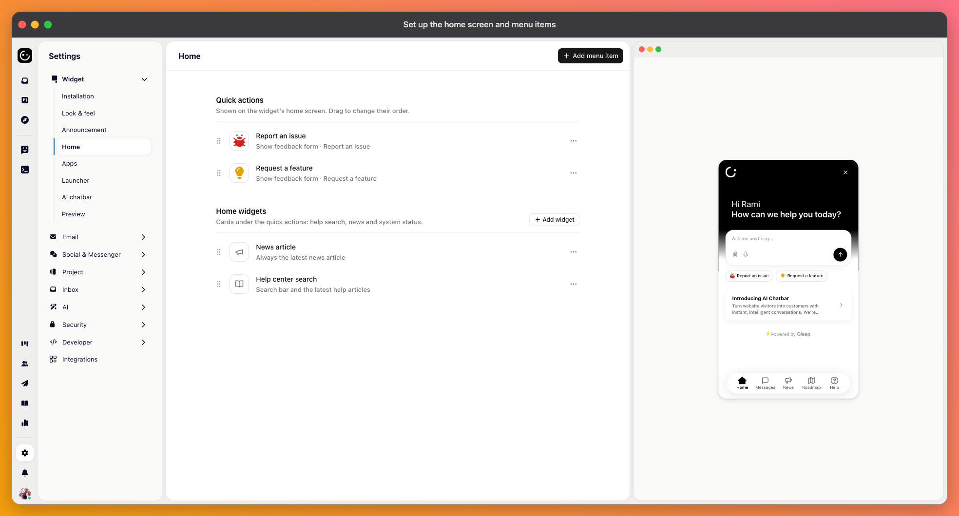
The home screen is the first thing customers see when they open the messenger, and what you put there largely decides what kind of contact you get. It has three parts: home widgets, menu items, and quick actions.
These are the options a customer can choose. Each has a title, an optional description, an icon, and an action — one of three:
Start a workflow — anything you've built in Automation, from a bug report form to a conversation with Kai. The most common choice.
Open a URL — your status page, a booking link, your community. You can have it open in a new tab.
Trigger a custom action — you give it a name and your own code reacts to it. Use this to open something inside your product rather than sending people to a web page.

Each item can carry audience rules, so it appears only for the customers it applies to. “Contact your account manager” for enterprise customers, an upgrade prompt only for people on a free plan, a beta feedback option only for participants.
This is the difference between a home screen that stays short and one that grows a line every time a team has a request. Rules depend on knowing who the customer is, so it works best when you identify your users.
Home widgets are blocks on the home screen — your latest news, help center search, a checklist someone hasn't finished. Quick actions are the short suggestions offered alongside the composer on the Agentic homes.
Both are easy to over-fill. Everything you add pushes the thing people actually came for further down.
Put the most common reason for opening the messenger first. For most products, that's asking a question, which argues for starting a conversation at the top and specialised forms below it.
A useful test: if a customer had to pick without reading carefully, would they land in the right place? Options that only make sense after reading a description tend to be picked wrongly, and a misrouted conversation costs more than a slightly longer menu.