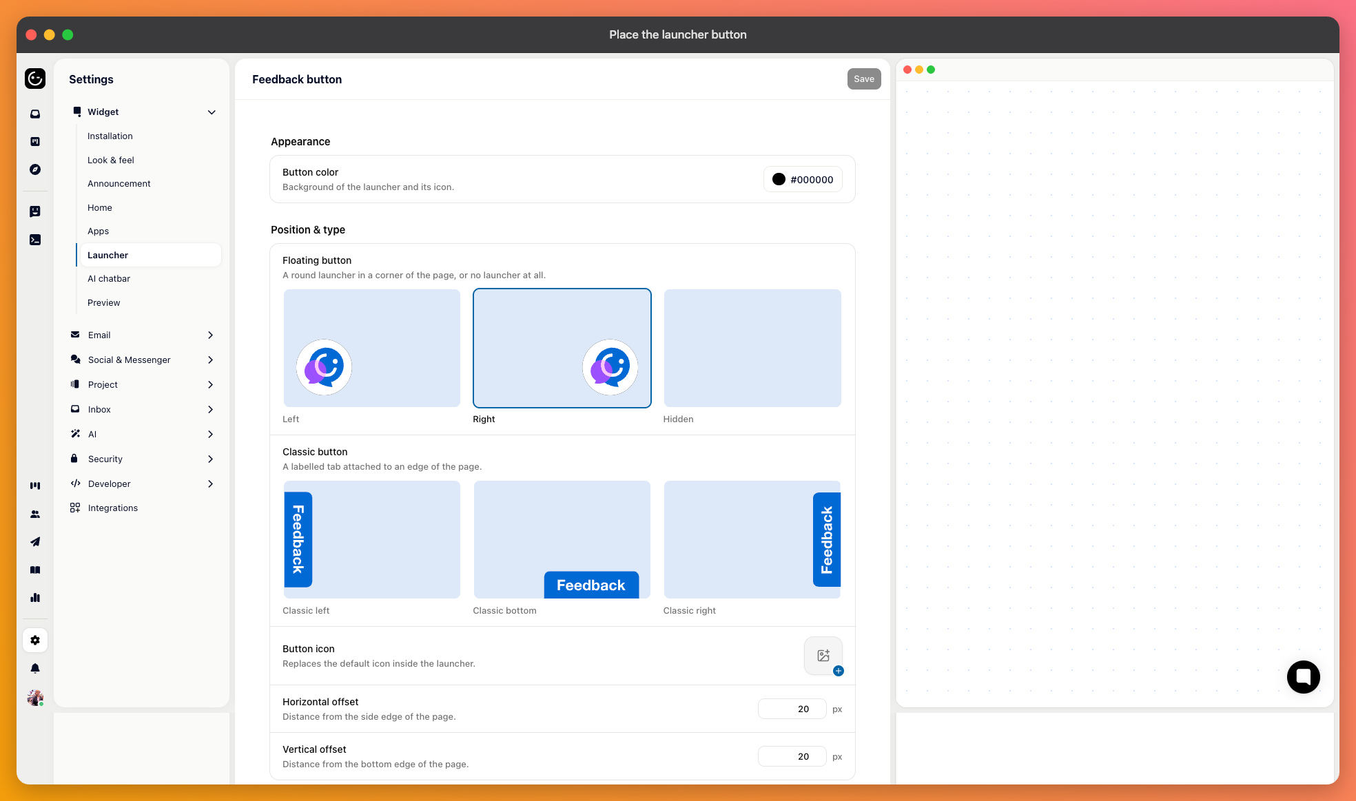
The launcher is the button that opens the messenger. Its settings live under your widget configuration, with a preview beside them.
Six choices. A floating round button in the bottom left or bottom right; a classic tab attached to the left edge, the right edge, or the bottom; or no button at all.
Bottom right is what most people expect, which is an argument for using it — customers look there without being told. Bottom left is worth it when something of yours already occupies the right corner.
The edge tabs suit sites where the messenger is a secondary path and shouldn't hover over the content.
Set the button colour, an optional logo, and button text for the tab styles. Keep the text short — “Help” or “Support” reads at a glance; a sentence doesn't.
The X and Y offsets nudge the button away from its default spot. That's what you need when it lands on top of a cookie banner, a chat bar of your own, or a mobile navigation bar.

Choosing no button hides the launcher entirely, and you open the messenger from your own interface instead:
Gleap.open();This is the right choice when you already have a help menu, or when support should be reachable only from certain screens. Put it behind an existing “Help” or “Contact us” item rather than adding a second entry point of your own.

You can also keep the button but hide it on particular screens — during checkout, in a full-screen editor, on a signup flow you don't want interrupted:
Gleap.showFeedbackButton(false);Remember to switch it back on afterwards. Hiding it on entering a flow and forgetting the other half is a common way to lose the launcher on more pages than intended.